

Today I’m going to show you a prompt for Claude that delivers an email audit that’s better than what comes out of the box in Klaviyo.
It’s a Klaviyo Engagement Audit that runs in 30 seconds and gives you full visibility into issues before they become revenue drains.
I’ve noticed that most marketers monitor email engagement the wrong way. Klaviyo provides standard email metrics like open and click rate.
But what looks like smooth, consistent performance is actually loaded with peaks and dips that most marketers miss because they’re only seeing a zoomed out picture. Instead, use a Claude prompt straight out of our guide, Claude + Klaviyo Deliverability Guide.
In this post you will learn:
- My actual Claude prompt that will give you real-time insight into deliverability health
- How to interpret and act on a 90-day Klaviyo engagement audit, week by week
- How to identify risks and anomalies before they become deliverability problems
What Standard Klaviyo Email Engagement Audits are Missing
Klaviyo Analytics for Deliverability reports on the last 30 days by default, with options for 7 days and 90 days.
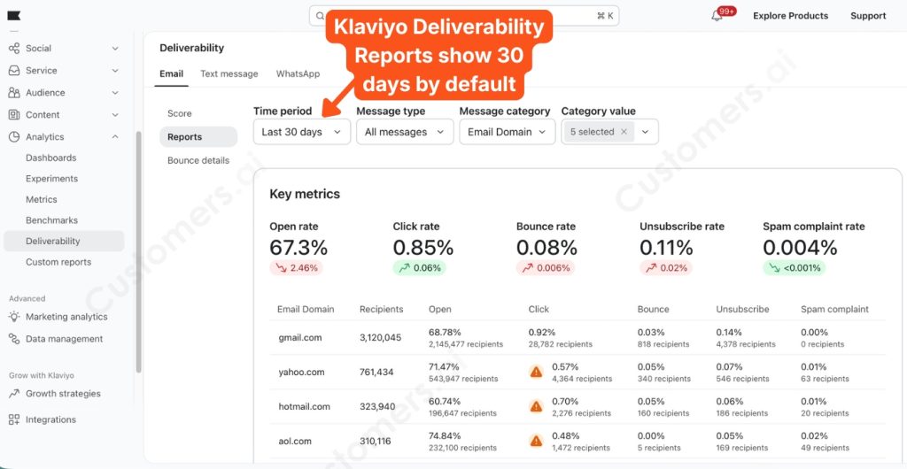
Klaviyo reports on email deliverability by month, which gives a high-level view for viewing trends or sharing with the board [Figure 1].
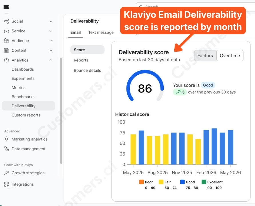
But standard Klaviyo Engagement Audit reports on last month’s numbers are not good enough for making adjustments to issues before they start impacting revenue [Figure 2].
A 90-day average of 67% open rate sounds healthy.
But if one week had an open rate of 53% while unsubscribes tripled, the monthly report might gloss over the volatility.
The only way to see a problem is to monitor deliverability weekly.
So we wrote this prompt, which you can find (along with 13 others) in the Claude + Klaviyo Email Deliverability Guide:
Use the Klaviyo MCP to do the following. Pull my account-level email engagement for the last 90 days, broken into weekly buckets. Show open rate, click rate, unsubscribe rate, and spam complaint rate per week, and note any week that stands out from the surrounding weeks in either direction.
Format the result exactly like this:
…
Account health · last 90 days (weeekly)
→ week of [date]: open [%] · click [%] · unsub [%] · spam [%]
…one line per week, oldest first
STANDOUTS:
→ [week]: [what stood out and by how much]
…one line per standout, or “none, steady across the window”
read: [one line, stable, trending up, trending down, or mixed]
Output only the format above, no preamble.
The Klaviyo Engagement Audit in Practice: What 90 Days of Weekly Data Looks Like
When you paste that Claude prompt, connected to a Klaviyo MCP server (full how-to guide), you get a report that looks like this [Figure 3]:
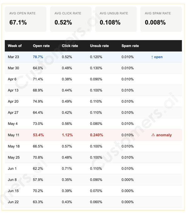
Now I’ll walk you through how to read an actual 90-day Klaviyo engagement audit that’s reported in weekly periods.
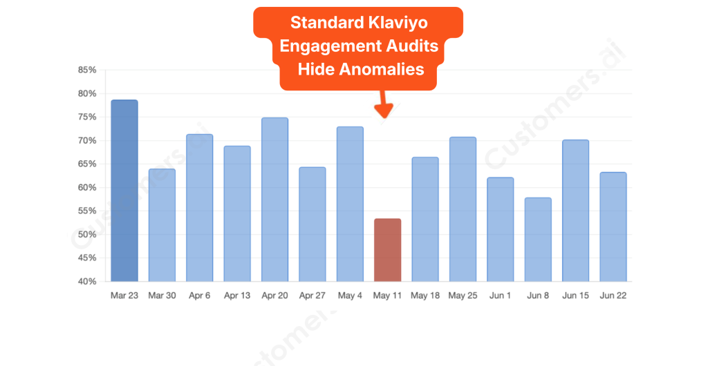
The weekly view tells a completely different story than the averages alone — and the chart below makes the shape of that story impossible to miss [Figure 4].
Email Engagement Health Standouts: The Weeks That Need a Closer Look
The monthly report hides two weeks that broke the illusion of uniformity [Figure 5].
- March 23: The 78.7% open rate is way above the 90-day average. Figure out why and reverse-engineer it.
- May 11: The 53.4% open rate is nearly two standard deviations below average, the click rate nearly tripled to 1.1%, and the unsubscribe rate hit 0.240%, also way above average.
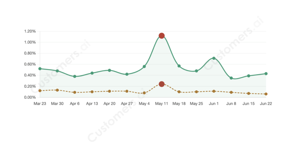
Low opens + high clicks + high unsubscribes indicates the targeting was too broad.
This isn’t a subject line problem. This is a list problem.
How often does this problem resurface? With a weekly report, you can see patterns that the 90-day summary misses and catch anomalies before they become trends that damage your business.
Email Engagement Insights from This Audit
- Averages lie. A 67% average open rate is meaningless if one week inside it hit 53% with tripled unsubscribes. Weekly granularity is the minimum useful resolution for email engagement health.
- The combination of metrics tells the story the individual metrics can’t. Open rate alone doesn’t explain May 11. Taken separately, open rate, click rate, and unsubscribes can’t explain May 11. You need all the metrics together to make the diagnosis obvious.
- High opens are as worth investigating as low opens. The March 23 spike almost certainly contains a repeatable insight. Don’t let good weeks pass without asking why.
- Spam near zero and falling unsubscribes mean deliverability fundamentals are sound. The risk here is content and targeting, not infrastructure.
- The soft open rate drift warrants a fresh look. Send frequency, segment freshness, and suppression list hygiene are the first places to check when opens drift without a clear event trigger.
In summary, monthly and quarterly reports are great for big picture trends or to show to the board.
The 7-day report in Klaviyo leaves it to you to see which weeks are anomalous.
This Claude prompt enables you to compare weeks at a time in one place to make the best decisions by serving up an actionable Klaviyo engagement audit.
One last pro tip: You can set Claude to run that prompt on a weekly schedule that pushes its report to you.
Get a real Klaviyo email audit in 30 seconds with a copy-and-paste Claude prompt, how to set the prompts up to run on a schedule, and see 13 more email deliverability prompts in our Claude + Klaviyo Deliverability Guide.↗
Frequently Asked Questions About Klaviyo Engagement Audits
What is a Klaviyo engagement audit?
A Klaviyo engagement audit is a review of your email performance metrics — including open rates, click rates, unsubscribe rates, and spam complaints — to identify trends, risks, and opportunities in your email program. This article recommends looking at those metrics weekly rather than monthly to catch issues before they hurt revenue.
Why isn’t the standard Klaviyo deliverability report enough?
Klaviyo’s default reporting focuses on 30-day or monthly averages. Those averages can hide major performance swings that occur within a single week, making it harder to spot deliverability problems early.
Why should I analyze engagement weekly?
Weekly reporting helps you identify anomalies immediately instead of discovering them weeks later in a monthly summary. A single bad week can reveal targeting or list quality issues long before they become serious deliverability problems.
Which metrics matter most in an engagement audit?
The most useful metrics are:
- Open rate
- Click rate
- Unsubscribe rate
- Spam complaint rate
The relationship between these metrics often tells a more important story than any individual metric by itself.
What does low open rate combined with high clicks and high unsubscribes mean?
This pattern usually indicates overly broad targeting. The people who are interested click, but too many recipients feel the email isn’t relevant and unsubscribe. In most cases, this is a list segmentation problem rather than a subject line problem.
What unsubscribe rate should concern me?
There is no universal threshold because industries vary, but sudden spikes matter more than absolute numbers. A jump from 0.08% to 0.24% in a single week is often more important than whether your average unsubscribe rate is 0.10% or 0.12%.
Should I investigate unusually good weeks too?
Absolutely. Exceptional performance often contains repeatable insights about segmentation, offers, timing, or creative that can be applied to future campaigns. High-performing weeks deserve as much analysis as poor-performing ones.
What if my spam complaint rate is near zero?
That’s generally a sign that your technical deliverability foundation is healthy. If opens decline while spam complaints remain low, the issue is more likely related to content relevance, audience targeting, or list quality than sender reputation.
What causes open rates to slowly decline over time?
The most common causes are:
- Audience fatigue
- Aging list segments
- Sending too frequently
- Poor suppression hygiene
- Reduced relevance in targeting or messaging
These should be your first areas of investigation when engagement slowly drifts downward.
How long of a time window should I analyze?
A 90-day window provides enough data to identify trends while still being recent enough to be actionable. Breaking those 90 days into weekly buckets creates the right balance between context and visibility.
Can I automate this audit?
Yes. The article recommends using a Claude prompt connected to a Klaviyo MCP server and scheduling it to run automatically every week so you receive ongoing engagement reports without manual analysis.
Is this useful for smaller brands?
Yes. In fact, smaller brands often benefit the most because a deliverability issue affects a larger percentage of their revenue. Catching an engagement problem after one bad week is much cheaper than discovering it after an entire quarter of declining performance.
What should I do immediately after finding an anomaly?
Start by asking:
- What changed that week?
- Did we email a different segment?
- Did send volume increase?
- Was there a new offer or promotion?
- Did frequency increase?
- Did we suppress inactive users properly?
The goal isn’t simply to identify anomalies — it’s to understand their cause and decide whether to repeat or avoid them in the future.