You’ve got visitors rolling into your ecommerce store but how many are actually pulling out their wallets?
Not as many as you’d like, right? Ouch.
It’s not because your products aren’t amazing (they are). It’s because your site isn’t doing enough to turn curious browsers into loyal buyers.
Here’s the thing…most ecommerce store owners focus on the obvious stuff like adding flashy CTAs and running discount ads.
But what about the sneaky, overlooked optimizations that actually move the needle? The tweaks you don’t hear about because everyone’s too busy recycling the same tired tips?
That’s where we come in. We’re diving into 10 fresh, overlooked ecommerce store conversion optimizations you probably haven’t tried yet.
These aren’t your basic “add free shipping” tips. They’re strategies that are practical, creative, and proven to squeeze more juice out of your existing traffic.
So buckle up, because by the time you’re done reading, you’ll be armed with real, useful, and actionable ideas to turn those “meh” conversion rates into a sales explosion.

Webinar: 2024 Playbook
Increasing Traffic & Conversions in the Age of AI
1. Know Your Visitors: The Power of Visitor Identification
How much do you really know about the people landing on your site?
Sure, you’ve got traffic numbers and maybe some heatmaps showing where they click but unless they’re actually logging in or filling out forms, most visitors are just faceless stats in your analytics dashboard.
That’s a problem.
Website visitor identification flips the script, showing you who’s lurking behind all those “anonymous” sessions. And with the right tools, you can figure out who’s browsing your site – even if they don’t take obvious actions. It’s not magic but it is one of the most overlooked ways to optimize your ecommerce store.
Why it Matters
Ecommerce store conversion is all about connection. If you know who is visiting, you can tailor your site, messaging, and offers to match what they’re looking for.
Visitor identification gives you the insights to stop guessing and start personalizing.
How to Optimize This
- Use Visitor Identification Tools: Tools like Customers.ai can help you uncover anonymous visitors by linking their activity to known company domains or profiles.
- Segment Smarter: Once you identify visitors, segment them based on behavior (e.g., frequent cart abandoners, category browsers) or traits (e.g., location, company size).
- Personalize Everything: Sync this data with your CRM or dynamic content tools to deliver tailored experiences. Think personalized product recommendations or localized promotions that make visitors feel like your store was built just for them.
Quick Win
Add the Customers.ai pixel to your site and start capturing more customers. Here is how to identify your website visitors with Customers.ai.:
1. Sign up for a free account
If you don’t already have a Customers.ai account, sign up here (no credit card is required) and connect your business.
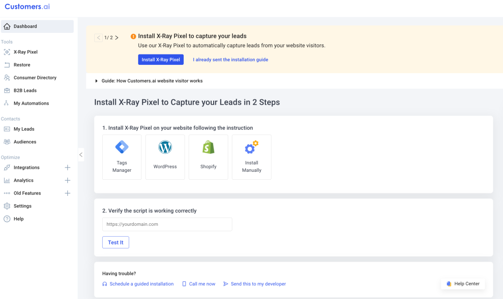
2. Install the x-ray pixel on your site
Installing the website identification x-ray pixel is easy and can be done through Tag Manager, Shopify, WordPress, and more
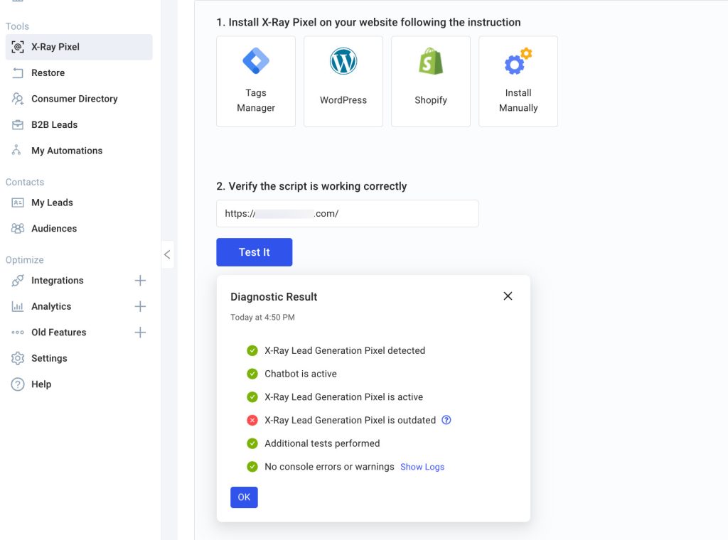
3. Verify the x-ray pixel is firing
4. Start identifying your website visitors
That’s it! Once the pixel is installed and verified, you can start identifying your website visitors.
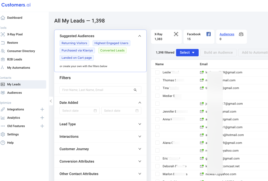
And with the highest capture rate in the industry, you should start seeing visitors immediately.
Knowing your visitors is the first step to converting them. The more you understand about who’s visiting and what they want, the easier it is to turn them into paying customers. And hey, isn’t that the whole point?
2. The Microcopy Magic Trick
You know those tiny pieces of text scattered across your site? The ones that explain a button, guide someone through a form, or reassure them during checkout?
Yeah, that’s microcopy.
It’s small, but it’s mighty. In fact, good microcopy can be the difference between “meh, maybe later” and “TAKE MY MONEY!”
Most ecommerce stores don’t give microcopy the love it deserves. They slap generic text on buttons (“Submit”), leave form fields unexplained, and miss golden opportunities to build trust and boost conversions. Let’s fix that.
Why Microcopy Matters

Microcopy works its magic in the background. It reassures shoppers they’re making a good decision, answers silent doubts, and gives them the confidence to move forward.
Think of it as the friendly salesperson for your online store, always there, but never pushy.
Where to Optimize Microcopy
- Buttons: Swap vague CTAs like “Submit” with action-driven ones like “Get My Discount” or “Complete My Order.”
- Form Fields: Add clarifying text (e.g., “We’ll never spam you” under an email field) to ease friction.
- Checkout Pages: Use trust-building phrases like “Secure Checkout” or “You can edit this later” to reduce cart abandonment.
- Product Pages: Answer common objections subtly, e.g., “Why this product?” links or “Hurry! Only 3 left in stock.”
Before-and-After Microcopy Makeover
Before
- Button: “Submit”
- Form Field: “Email” (no explanation)
- Checkout: No messaging about security or returns
After
- Button: “Get My 10% Off!”
- Form Field: “Email (We’ll send you order updates—no spam, promise!)”
- Checkout: “Your payment is secure. Free returns within 30 days.”
Quick Win
Run an A/B test on one key piece of microcopy—like your checkout button. Swap “Submit” for something benefit-driven, and track how it impacts conversions. You’ll likely see that a small tweak makes a big difference.
Microcopy may be tiny but it packs a punch when optimizing your ecommerce store conversion strategy. So go ahead and give those little words some love!
3. Kill the Dead Ends: Smart 404 and Thank You Pages
Your 404 error pages and “Thank You” pages are basically the forgotten corners of your ecommerce store.
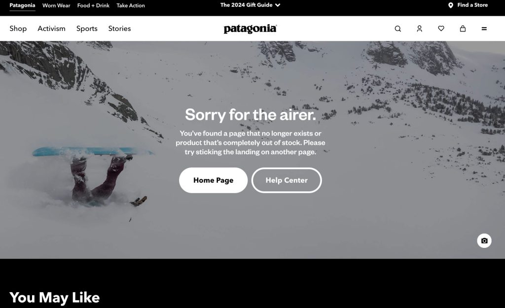
They’re like the junk drawer in your kitchen…ignored until someone stumbles upon them and wonders why they even exist. But what if these “dead ends” could actually drive sales and engagement?
Spoiler alert: they can.
The Problem
Most 404 pages look like this – “Oops! Page not found.” That’s it. No directions, no value, just a dead stop.
And “Thank You” pages? They usually say something like, “Thanks for your order!” and leave it at that. Both are massive missed opportunities!
The Solution
Turn these neglected pages into high-performing engagement tools. Instead of letting visitors hit a wall, give them something valuable that keeps them in your store or brings them back later.
How to Optimize
For 404 Pages:
- Add Helpful Links: Suggest popular categories or products to redirect lost visitors.
- Throw in a Discount: “Lost? Let us make it up to you. Here’s 10% off!” works wonders for turning frustration into delight.
- Make It Fun: Add some humor or creativity. Think quirky visuals or clever copy that aligns with your brand voice.
For Thank You Pages:
- Upsell or Cross-Sell: Suggest complementary products. “Loved this? You might also like…” is a classic but effective approach.
- Encourage Social Sharing: Add a share button with a pre-written message like, “Just snagged this amazing deal at [Store Name]!”
- Loyalty Program Hook: Invite them to join your rewards program or offer points for their purchase.
Real-World Impact
A clothing brand revamped its 404 page by turning it into a product recommendation hub with a playful message like, “Lost your way? No worries, let’s get you back on track.”
The result? A 30% decrease in bounce rate and a 15% lift in conversions from people who ended up buying redirected products.
Similarly, a DTC skincare brand added a referral program link to its Thank You page, leading to a 20% increase in new customers from referrals.
Quick Win
Add a “Continue Shopping” button and a product carousel to your 404 page. For your Thank You page, experiment with an exclusive post-purchase offer like, “Unlock 15% off your next order—valid for 24 hours!”
Who knew getting lost or saying thanks could be so profitable? A simple but brilliant ecommerce store conversion optimization tactic.
4. Leverage Exit-Intent Popups Wisely
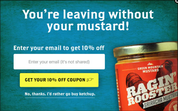
Exit-intent popups get a bad rep. Why?
Because most stores use them like a last-ditch “WAIT, DON’T LEAVE ME!” plea, throwing generic offers at visitors without rhyme or reason.
But when done right, these popups can be awesome revenue drivers, capturing attention at the exact moment someone’s about to bounce and turning hesitation into action.
Why Most Stores Fail
You’re browsing a site for a new pair of running shoes. You hover near the top of the screen, and BOOM—a popup screams, “Sign up for our newsletter!”
Uh, no thanks.
The issue? Poor timing and irrelevant offers. If your popup doesn’t match the visitor’s intent or interests, it’s just noise.
The Overlooked Approach
Dynamic exit-intent popups change the game. Instead of serving the same message to everyone, tailor your popups based on user behavior.
For example:
- Browsing a Specific Category? Offer a discount on items in that category.
- About to Abandon a Full Cart? Highlight free shipping or an extra discount to seal the deal.
- First-Time Visitor? Showcase an irresistible new-customer offer like “10% off your first order!”
How to Optimize Your Popups
- Get the Timing Right: Use tools to detect exit intent—like when the cursor moves toward the browser bar.
- Customize the Message: Match the popup content to the visitor’s behavior or location on your site.
- Limit the Noise: Don’t overdo it—show popups strategically, not every time someone even thinks about leaving.
Quick Win
Try a tool like OptinMonster, Privy, or Sleeknote to create behavior-driven popups. Many of these platforms offer templates designed to fit different goals, like cart recovery or list building.
Bonus: most of them come with A/B testing features, so you can experiment and see what works best.
Real-Life Example
A fitness apparel brand implemented dynamic exit popups that offered a free gift (like socks or a water bottle) with purchases over $50. Result? A 25% reduction in cart abandonment and a noticeable boost in average order value.
Stop begging your visitors to stay and start giving them a reason to stick around.
5. Bring Reviews and Social Proof Into the Spotlight
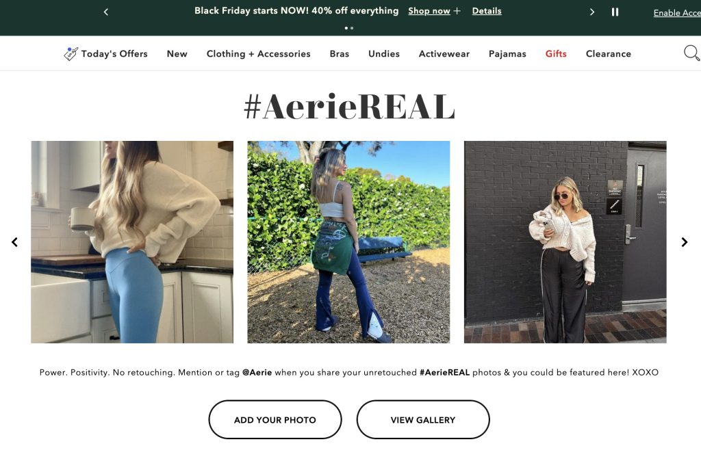
Shoppers don’t always trust you but they do trust other customers.
That’s why reviews and social proof are essential for your ecommerce store. Unfortunately, too many brands treat them like an afterthought.
Burying reviews at the bottom of a product page or making shoppers dig for them? Rookie move. Let’s fix that.
The Problem
Too many ecommerce stores fail to use reviews effectively. Either they’re hidden away in the depths of product pages, overwhelmed by outdated feedback, or worse, there’s no way to know if the reviewer actually bought the product. These missteps create doubt and cost you sales.
The Solution
Social proof should be front and center, especially at key decision-making moments. Shoppers want reassurance that they’re making a good choice, and well-placed reviews or testimonials provide that confidence boost.
How to Optimize Your Reviews
- Showcase Reviews in Strategic Spots:
- Add a review carousel on your homepage to highlight bestsellers or new arrivals.
- Include top reviews on product recommendation widgets or upsell sections.
- Show reviews directly in the cart (e.g., “Loved by 1,200+ happy customers!”).
- Filter for Trustworthy Feedback:
- Use tags like “Verified Buyer” or “Recent Purchase” to build credibility.
- Highlight reviews that address common objections or showcase specific use cases.
- Incorporate UGC (User-Generated Content):
- Display customer photos and videos alongside text reviews to make the experience more authentic.
- Use social media shoutouts or tagged photos to create a “community vibe.”
Pro Tip
Make reviews interactive. Allow customers to sort them by most helpful, newest, or even by product features (“Best for summer” or “Great for sensitive skin”). This makes it easier for shoppers to find the info they care about most.
Quick Win
Add a review summary at the top of your product pages. Include the average star rating, total number of reviews, and a snippet of a glowing testimonial. Bonus points if you make it clickable, so visitors can dive into the full review section with one click.
By putting social proof where it matters most, you’ll build trust, ease doubts, and give shoppers that extra nudge to hit “Buy Now.” It’s the ultimate ecommerce store conversion optimization strategy!
6. Invest in Killer Mobile Navigation
If your ecommerce store doesn’t work flawlessly on mobile, you’re practically begging customers to bounce. If shoppers can’t find what they need quickly and easily on their phones, they’re out and they’re not coming back.
Why Mobile-First Matters
Over 50% of ecommerce traffic now comes from mobile devices.
Yet, many stores still cling to desktop-first designs, leaving mobile users frustrated with endless scrolling, tiny buttons, or menus that feel like a treasure hunt. Don’t let your store be part of the problem.
What to Fix
- Simplify Menus:
- Keep your menu short, sweet, and easy to navigate. Group items logically and avoid overwhelming shoppers with too many options.
- Use expandable categories (think dropdowns or accordions) to save screen space.
- Make CTAs Thumb-Friendly:
- Ensure call-to-action (CTA) buttons are big enough to tap without fat-finger mishaps.
- Position CTAs within thumb-reach zones, so users don’t have to perform digital gymnastics to click “Add to Cart.”
- Add Sticky Headers:
- Keep your navigation bar and search functionality accessible as users scroll. A sticky header means shoppers can quickly jump to other sections without having to scroll all the way back up.
Bonus Features to Wow Mobile Shoppers
- Voice Search: Make life easy for multitaskers by adding voice search capabilities. Let’s face it, sometimes typing on a tiny screen is a pain.
- Tap-to-Call Buttons: If your store involves services or high-ticket items, adding a “Tap to Call” button can be a game-changer for high-intent buyers.
Pro Tip
Test your mobile navigation on actual devices, not just simulators. Try using your site one-handed while walking – if it’s not intuitive, it’s time to rethink the design.
Quick Win
Run a heatmap test for mobile users to see where they’re tapping (or struggling). Use the insights to tweak your menu layout and button placement for a smoother experience.
Remember: if your navigation isn’t killing it, it’s killing your sales. Fix it, and watch your sales numbers soar.
7. Use Urgency Without the Desperation
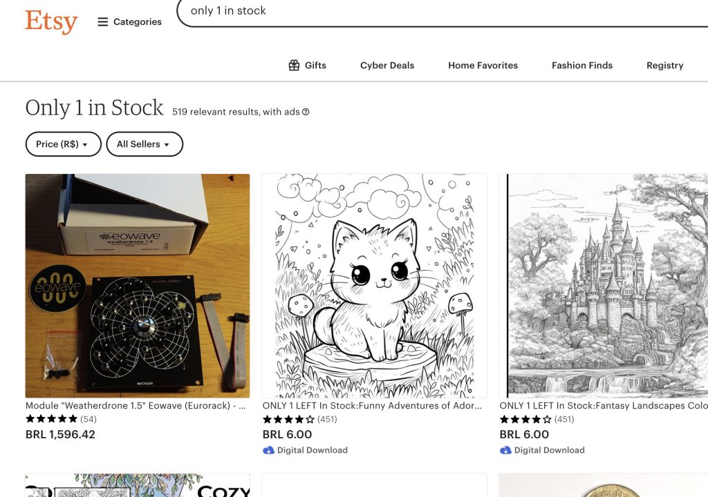
You’ve seen it before, the “Only 1 left in stock!” warning plastered across every product page, only to see the same thing a week later.
Shoppers aren’t stupid and overusing fake urgency tactics is just lazy.
Real urgency, when used authentically, however, is a powerful tool that can nudge hesitant buyers into action without making them roll their eyes.
The Common Mistake
Many stores lean too hard on fake scarcity, like countdown timers for sales that magically reset or claims of “limited stock” that no one believes.
These tactics can actually hurt your brand’s credibility.
What Works: Authentic Urgency
The secret to effective urgency is honesty. Instead of slapping urgency on everything, focus on real, time-sensitive opportunities:
- Limited-Time Bundles: Create product bundles that are only available for a short period, like holiday-themed sets or exclusive collaborations.
- Real-Time Stock Counters: Highlight genuine low-stock items with live updates (and make sure it’s actually accurate).
- Shipping Cutoffs: Use clear messaging like “Order within 2 hours to get it by Friday!” to push fast decisions.
How to Do It Right
- Be Transparent: If something is limited, explain why. For example: “This product is handcrafted, and only 100 are made each month.”
- Focus on Value: Urgency should enhance the customer’s experience, not pressure them. Pair it with benefits, like exclusive discounts or freebies.
- Use Visual Cues: Bright colors, timers, or banners can grab attention, but don’t go overboard. Subtlety matters.
Real-Life Examples
- Patagonia: They use urgency for seasonal stock changes—“Last chance to grab winter gear before it’s gone!” feels honest and actionable.
- Amazon: Real-time updates like “Only 3 left—order soon!” show shoppers exactly how fast inventory is moving.
Quick Win
Add a shipping deadline banner to your product pages during key shopping periods. Something as simple as “Order by 3 PM today for next-day delivery” can create a sense of urgency without feeling forced.
Urgency done right builds excitement, not skepticism. Keep it genuine.
8. Personalize the Journey (Without Being Creepy)
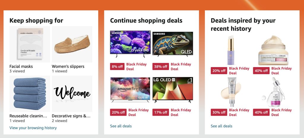
Nobody wants to feel like your store is watching them, but let’s be honest, shoppers do want a personalized experience.
The trick is finding that sweet spot between “Wow, this is exactly what I need!” and “Why does this site know I was looking for socks at 2 AM?”
Personalization is all about serving relevant, helpful suggestions without being invasive.
What to Optimize
- Dynamic Product Recommendations
- Show “You May Also Like” or “Recently Viewed” sections tailored to individual browsing habits.
- Highlight complementary products (“Bought running shoes? Check out these no-show socks!”).
- Personalized Email Campaigns
- Segment your audience by purchase history, behavior, or demographics to send hyper-relevant emails.
- Include dynamic content like “We thought you’d love these!” with products tied to their preferences.
- Location-Specific Promotions
- Use geotargeting to display relevant offers. Example: Free shipping for local customers or promotions tied to regional holidays.
- Optimize timing for campaigns based on time zones to catch customers when they’re most likely to shop.
Overlooked Tools to Make This Seamless
- Klaviyo: Perfect for personalized email flows and behavioral targeting.
- Nosto: Specialized in dynamic on-site personalization and product recommendations.
- Justuno: Great for delivering targeted popups based on visitor behavior and demographics.
The Data Doesn’t Lie
According to studies, 80% of shoppers are more likely to buy from a brand offering personalized experiences, and personalized product recommendations can boost average order value by up to 30%.
Pro Tip
Use personalization to solve pain points. For example, if a customer abandoned their cart, send a follow-up email with their specific items plus a discount or free shipping offer to bring them back.
Remember, the goal isn’t to be a mind reader. It’s to create an experience that feels effortless and intuitive.
9. Simplify Your Checkout Flow
The longer and more complicated your checkout process, the fewer customers actually complete it.
If you want shoppers to follow through, you need to make paying as easy as possible.
Hidden Blockers That Tank Conversions
- Too Many Form Fields: Do you really need their middle name, date of birth, or pet’s favorite snack? No. Trim the fat.
- Forced Account Creation: Nothing screams “abandon cart” louder than “Sign up before you can buy.”
- Poor Payment Options: Limited or outdated payment methods alienate customers who expect flexibility.
Fixes to Streamline Your Checkout
- Autofill Capabilities
- Enable address autofill using tools like Google Places API.
- Save returning customer information so they don’t have to re-enter details.
- Express Checkout Buttons
- Offer PayPal, Apple Pay, Google Pay, or Shop Pay for one-click purchases.
- Highlight these options early in the process to cater to impatient shoppers.
- Clear Error Messaging
- Use real-time error detection with specific instructions (e.g., “Your ZIP code must be 5 digits”).
- Prevent frustration by showing errors as they type, not after they hit submit.
- Progress Indicators
- Show shoppers exactly where they are in the process with a simple step-by-step progress bar.
Real-Life Example: The Checkout Glow-Up
An online pet supply store reduced its checkout fields from 15 to 7 and added express checkout buttons. They also removed mandatory account creation, offering a “Guest Checkout” option instead.
The result? A 25% increase in completed purchases within the first month.
Quick Win
Audit your current checkout flow. Remove any unnecessary steps and add at least one express payment option. Even small tweaks, like reordering fields for logical flow, can make a big difference in optimizing your ecommerce store conversion flow.
10. Gamify the Shopping Experience
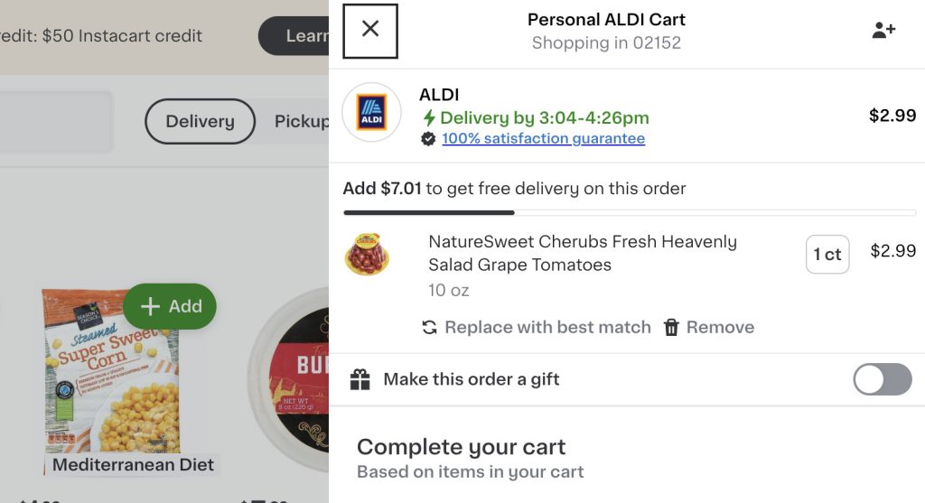
When shopping is fun, people spend more. That’s the magic of gamification.
By turning your store into a mini game with rewards, progress bars, and milestones, you can keep shoppers engaged, excited, and coming back for more.
Why Gamification Works
It’s all about dopamine! Gamification taps into our brain’s reward system, giving shoppers a little hit of satisfaction every time they achieve something – even something as minor as unlocking free shipping or leveling up in a loyalty program.
This sense of accomplishment keeps them hooked and encourages more spending.
Fresh Gamification Ideas
- Progress Bars for Freebies
- Show a dynamic progress bar on the cart page: “You’re $12 away from free shipping!”
- Create goals for discounts, like “Spend $50 to unlock 10% off your next order.”
- Loyalty Program Milestones
- Use tiers or levels (e.g., “Bronze, Silver, Gold”) to encourage repeat purchases.
- Offer exclusive perks for higher tiers, like early access to new products or bigger discounts.
- Spin-to-Win Popups
- Add a fun element to email sign-ups or promotions with a wheel-of-fortune style popup offering discounts, free shipping, or gifts.
- Limited-Time Challenges
- Run gamified promotions, like “Buy two items today and get a mystery gift!”
- Incorporate countdown timers to add urgency.
Tools to Implement Gamification
- Smile.io: Build loyalty programs with tiers, points, and rewards.
- Gameball: Create personalized customer journeys and achievements.
- WooCommerce Points and Rewards: Perfect for setting up gamified point systems for repeat purchases.
- Wheelio: Easy spin-to-win popups to engage shoppers.
Real-Life Example
A cosmetics brand introduced a progress bar on its cart page with the message: “Add $20 more to unlock a free gift!” This simple addition increased their average order value by 18%.
Quick Win
Add a “Spend $X more for free shipping” progress bar to your cart or checkout page. It’s an easy way to increase order value without feeling pushy.
Start Optimizing Your Ecommerce Store Conversions Today
Your ecommerce store doesn’t need a total overhaul to start seeing better conversions. Sometimes, it’s the little tweaks, the ones everyone else forgets about, that make the biggest difference.
We’ve covered 10 ecommerce store conversion optimization tactics that go beyond the basics. From making your 404 page actually useful to turning shopping into a dopamine-packed game, these strategies are here to boost your sales without the stress.
But don’t overthink it.
Pick one or two ideas that stood out to you. Maybe it’s sprucing up your microcopy or adding a progress bar for free shipping – test them out. Small changes add up fast, and the sooner you start, the sooner you’ll see results.
Oh, and let’s keep this fun. If you try something and it works (or even if it flops spectacularly), I want to hear about it. Share your wins, your fails, or your own genius ideas with us on social. Let’s swap notes and help each other crush it.
Now go out there and make your store the conversion powerhouse it’s meant to be! And don’t forget to start your free Customers.ai trial today and get 500 contacts free!
See Who Is On Your Site Right Now!
Get names, emails, phone numbers & more.
Try it Free, No Credit Card Required
Important Next Steps
- See what targeted outbound marketing is all about. Capture and engage your first 500 website visitor leads with Customers.ai X-Ray website visitor identification for free.
- Talk and learn about sales outreach automation with other growth enthusiasts. Join Customers.ai Island, our Facebook group of 40K marketers and entrepreneurs who are ready to support you.
- Advance your marketing performance with Sales Outreach School, a free tutorial and training area for sales pros and marketers.
